DALEY RESOURCES
Color Psychology in Branding: Expert Tips and Insights
Maureen Daley
Recently, I attended a networking event where the organizers kicked off the session with a simple icebreaker: “What’s your favorite color?” As I rushed in, barely catching the tail end of introductions, I listened to people share their answers. “Red, because I’m vibrant and fun!” one person said. “Lavender, because it’s calming,” another offered. “Hunter green, because it’s rich and stands out,” someone else chimed in. Each response was personal and spoke volumes about the individual.
But as the question made its way around the room, I felt a bit of nervousness rising. What would I say? The truth is, I don’t have a favorite color. Strange, right? Who doesn’t? For me, color isn’t just a preference or an aesthetic choice; it’s an experience, an emotion, even a physiological reaction. My relationship with color is fluid, shifting with how I feel or the audience I’m working with. It’s about crafting the perfect mood, evoking the right feeling, and stirring the desired emotion for my clients and their brands.
This is why I LOVE color. It’s not just a visual element—it’s a powerful tool. The way a particular hue or combination of shades can instantly evoke a memory or make us think of a brand is nothing short of magical. Consider the iconic red and yellow arches of McDonald’s. It’s hard not to feel a pang of hunger or a rush of childhood nostalgia when you see those colors. The same can be said for Tiffany & Co.’s robin’s-egg blue, which exudes luxury and exclusivity. These brands have mastered the art of using color to influence how we feel and what we remember.
The Emotional Power of Color
Colors have a profound impact on our emotions and behaviors, often in ways we don’t even realize. Let’s explore how different colors affect us and how brands use this knowledge to their advantage:
- Red: Often associated with energy, passion, and urgency, red is a powerful color. It can stimulate the senses, increase heart rates, and even make us feel hungrier. That’s why it’s used in fast-food branding, from McDonald’s to KFC, creating an environment that encourages quick decisions and instant gratification.
- Blue: A color of trust, calm, and reliability. It’s no surprise that many financial institutions, like Chase and PayPal, use blue in their branding. It reassures customers and promotes a sense of security and stability.
- Green: Symbolizing nature, growth, and health, green is frequently used by brands that want to promote eco-friendliness or wellness. Think of Whole Foods or Starbucks. The color green connects these brands with sustainability and a commitment to health.
- Yellow: Bright and cheerful, yellow is often associated with optimism and happiness. Brands like IKEA and Snapchat use yellow to convey friendliness and a sense of fun.
- Purple: Historically associated with royalty, purple exudes luxury, creativity, and mystery. It’s a favorite in the beauty industry, with brands like Cadbury and Hallmark using it to evoke a sense of premium quality and sophistication.
When choosing a brand color, it’s crucial not to select one arbitrarily or simply because it’s your personal favorite. Color should be chosen based on how you want your brand to be perceived and the emotions you want to evoke in your audience. For more insights on building a consistent brand identity, check out our blog on The Importance of Brand Consistency.
The Pantone Influence
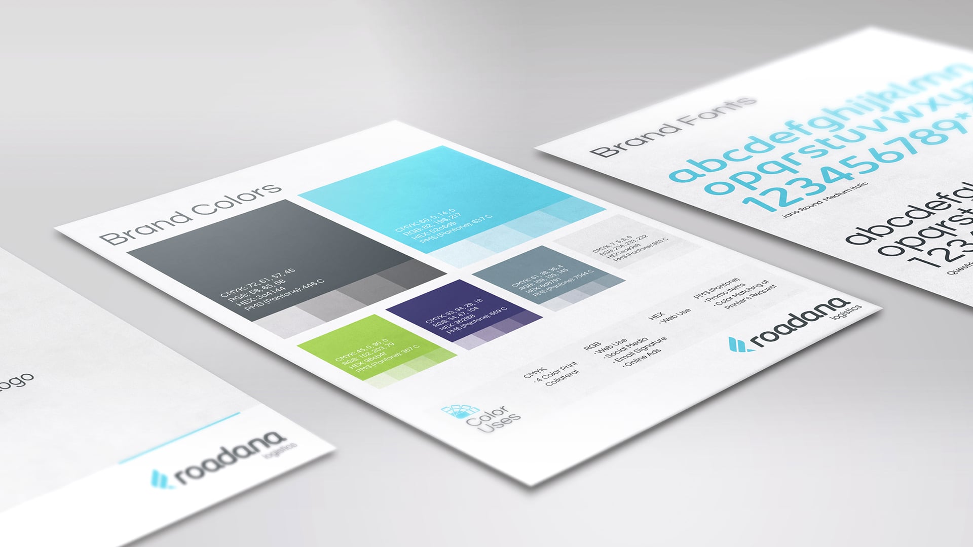
One of my favorite times of the year is when Pantone announces its Color of the Year. This selection is not just about a trendy hue; it’s a reflection of global culture, mood, and mindset. The chosen color influences fashion, branding, graphic design, and even interior design trends for the entire year.
For instance, when Pantone selected Classic Blue as the Color of the Year for 2020, it wasn’t just about a shade of blue. It was about conveying a sense of calm, confidence, and connection in a time of global uncertainty. This color popped up everywhere—from runway shows to branding refreshes—because it resonated deeply with the collective psyche.
The Pantone Color of the Year can be a valuable guide when you’re considering a rebrand or launching a new product. It’s an opportunity to align your brand with contemporary trends while still maintaining your unique identity. By leveraging this annual color trend, you can ensure your brand feels current and connected to the broader cultural conversation.
Tips for Choosing the Right Colors for Your Brand

Choosing the right colors for your brand isn’t just about picking what looks good or what you like personally. It’s a strategic decision that should be rooted in the psychology of color and aligned with your brand’s values, mission, and target audience. Here are some tips to guide you:
- Understand Your Brand’s Personality: Is your brand playful and fun, or is it serious and professional? The colors you choose should reflect your brand’s core personality. For example, a tech company focused on innovation might lean towards a sleek, modern palette with blues and grays, while a children’s toy company might opt for bright, primary colors that evoke joy and excitement.
- Consider Your Target Audience: Who are you trying to reach? Different colors resonate with different demographics. For instance, younger audiences tend to gravitate towards bolder, brighter colors, while older demographics might prefer more subdued, classic tones.
- Think About the Competition: Look at what your competitors are doing. You want your brand to stand out, so avoid choosing colors that are overly similar to those of your biggest competitors. At the same time, consider the industry standards. Certain industries have color norms—like blue for tech or green for health—that can help position your brand within that space.
- Keep It Simple: While it’s tempting to use a wide range of colors, simplicity often works best. A limited color palette can make your brand more recognizable and easier to remember. Think of brands like Apple or Nike, which use very few colors but are instantly identifiable.
Beyond Color: The Importance of Cohesive Branding

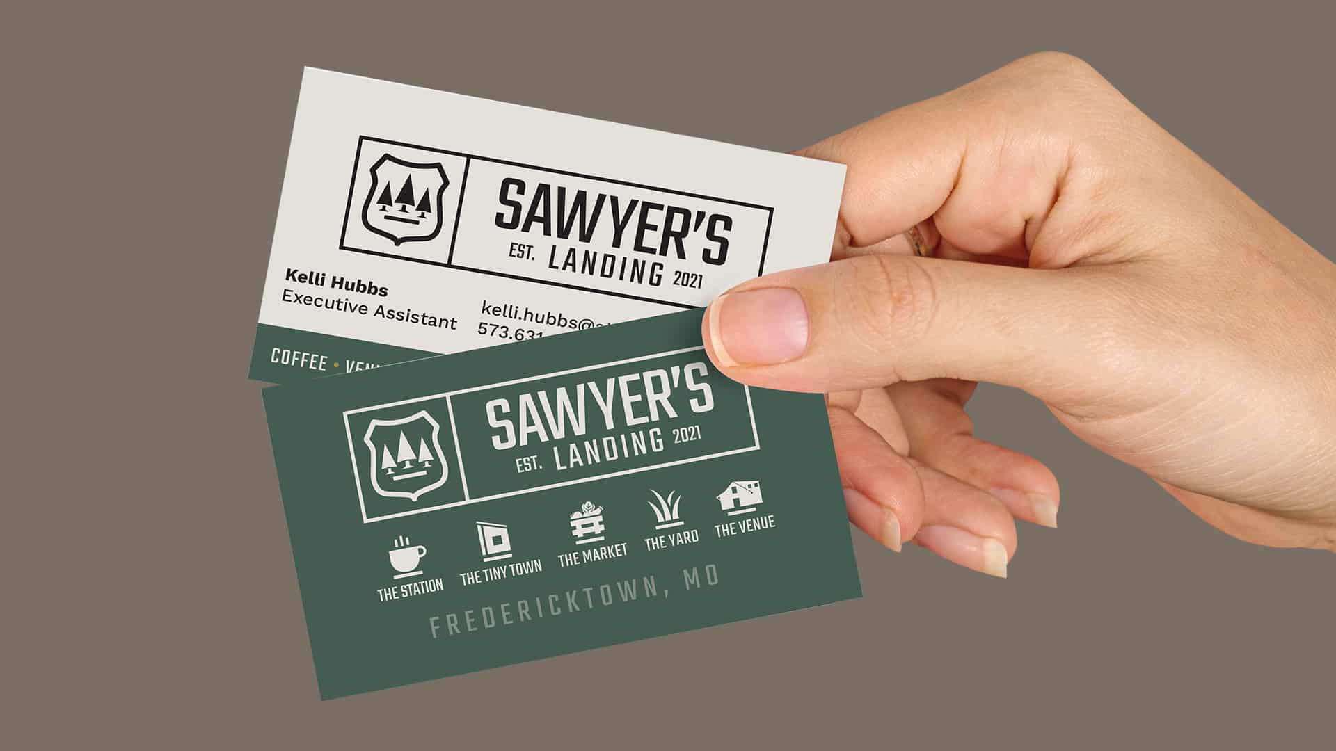
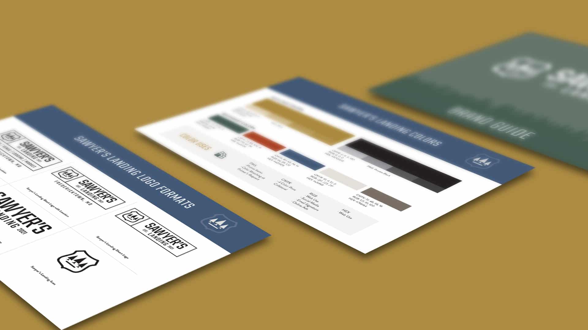
While color is a significant aspect of branding, it’s just one piece of the puzzle. To create a strong, cohesive brand, your color palette needs to work in harmony with other elements like typography, logo design, imagery, and icons.
- Typography: The fonts you choose should complement your color palette and convey the right tone for your brand. For example, a bold, sans-serif font might pair well with a bright, energetic color palette, while a more elegant serif font could enhance a sophisticated, muted color scheme. Typography isn’t just about aesthetics; it plays a crucial role in how your brand communicates its message. If you’re interested in understanding more about the impact of typography and how to make informed decisions about your brand’s fonts, our blog on Empowering Designers with Web Fonts offers valuable insights.
- Logo Design: Your logo is the face of your brand, and its design should reflect your color choices. A well-designed logo will incorporate your primary brand colors in a way that’s visually appealing and memorable.
- Imagery and Icons: The images and icons you use in your branding should align with your color palette. Consistency is key here; a cohesive look and feel across all your brand elements will make your brand more recognizable and professional.
Understanding the difference between a logo and brand design is essential. A logo is a symbol or mark that represents your brand, while brand design encompasses the entire visual identity of your brand, including color palette, typography, imagery, and more. A strong brand design will ensure that all these elements work together seamlessly, creating a cohesive and memorable identity. For a deeper dive into how these elements contribute to a powerful brand, check out our blog on The Power of Branding: Building a Strong Identity for Your Business.
Conclusion: Let’s Talk About Your Brand
Choosing the right colors for your brand is more than just a design decision—it’s a strategic move that can influence how your audience perceives and interacts with your brand. At Daley Design, we specialize in creating cohesive brand identities that resonate with your target audience and help you stand out in a crowded market. Whether you’re starting from scratch or looking to refresh your brand, our team is here to guide you through every step of the process.
In addition to selecting the perfect colors, understanding the overall value of strong branding is crucial. It goes beyond just visual appeal—it’s about creating a meaningful connection with your audience. If you’re interested in learning more about the importance of branding, check out our blog on The Value of Branding: Insights from The Bridge Collaboration.
Ready to take your brand to the next level? Let’s chat. Contact us today to discuss how we can help you create a brand that not only looks great but also connects with your audience on a deeper level.
Daley tips & tools
Sign up for our newsletter to learn business insights, expert tips and tricks to improve your business’s image online and off.
"*" indicates required fields
