DALEY RESOURCES
A Typeface Tale: The Timeless Brilliance of the "I Love New York" Logo
Maureen Daley

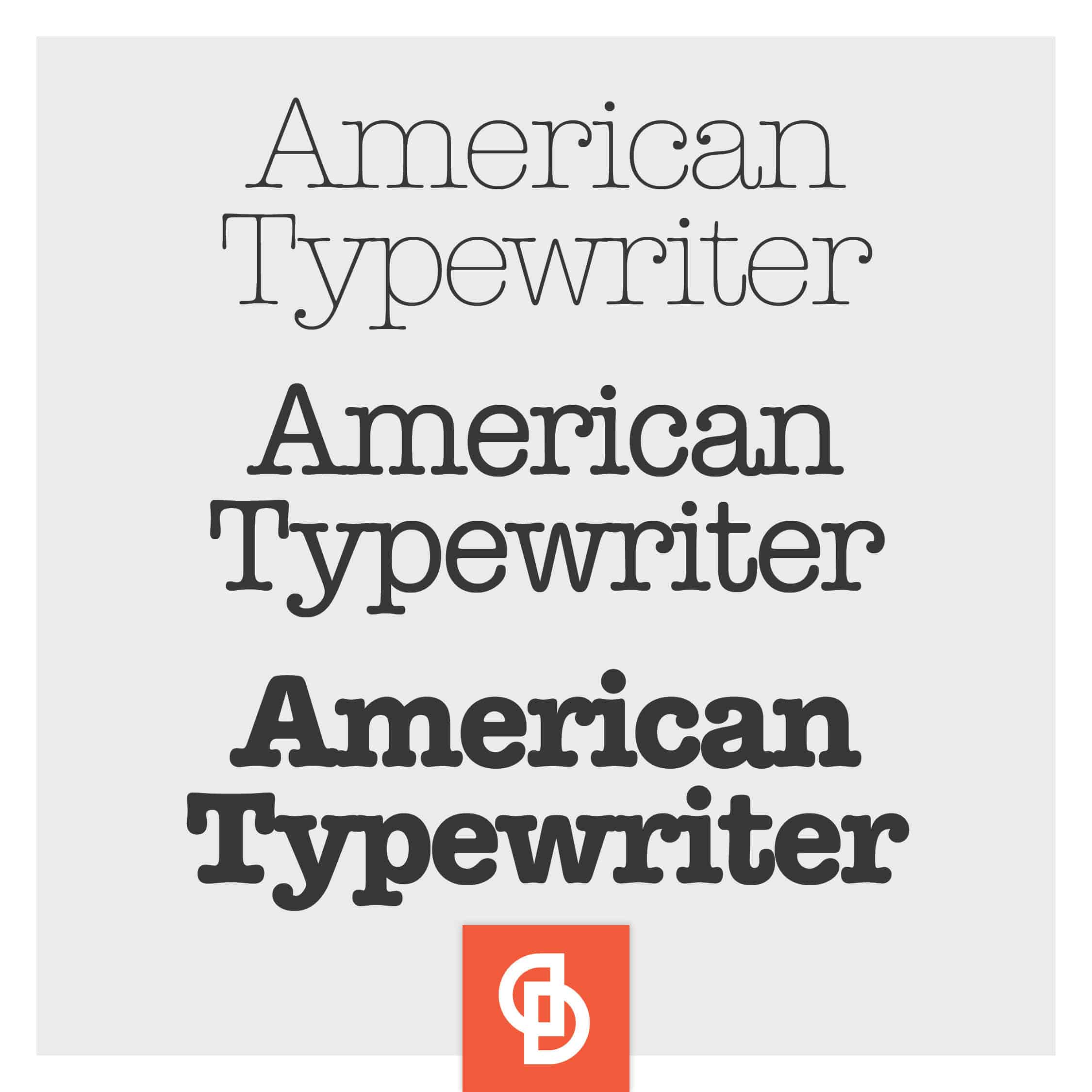
In the realm of design, few logos have achieved the iconic status and enduring popularity as the “I Love New York” logo. With its simple yet powerful message and distinctive font, this emblem has become a symbol of the Big Apple’s indomitable spirit. Today, we delve into the design brilliance behind this logo and explore how the choice of font, specifically American Typewriter, played a pivotal role in its success.
The Birth of American Typewriter
American Typewriter, the font that graces the “I Love New York” logo, was conceived in 1974 by graphic designer Joel Kaden and his partner Tony Stan. At the time, typewriters were ubiquitous in offices, providing a means of creating text with a distinct mechanical aesthetic. Kaden and Stan sought to capture the essence of this beloved device and translate it into a typeface that embodied the energy and character of New York City.
The Magic of Vintage Typewriter Style
American Typewriter stands out due to its vintage typewriter style. The letters exhibit imperfections, slight inconsistencies, and a touch of irregularity, replicating the look and feel of actual typewritten characters. This deliberate choice imbues the font with a sense of authenticity, nostalgia, and human touch. It evokes memories of a bygone era when typewriters were the lifeblood of communication.
The Synergy with the "I Love New York" Logo
When the “I Love New York” logo was created in 1977 by graphic designer Milton Glaser, he recognized the power of American Typewriter to communicate the logo’s message effectively. The rounded serifs, distinctive loops, and slightly condensed letters of the font perfectly complemented the heart symbol and the word “Love,” evoking warmth, approachability, and a personal connection.
American Typewriter's Role in Evoking Emotion
Fonts have a remarkable ability to evoke emotions and shape our perception of brands and messages. In the case of the “I Love New York” logo, American Typewriter creates a strong emotional response. Its association with typewriters brings a sense of authenticity, history, and craftsmanship, while its slightly retro aesthetic adds a layer of charm and timelessness. This emotional resonance contributes to the enduring popularity of the logo, making it instantly recognizable and universally beloved.
Beyond New York: Influence and Legacy
The influence of American Typewriter extends far beyond the “I Love New York” logo. Over the years, the font has been widely used in various contexts, including print advertisements, book covers, and movie titles. Its versatility lies in its ability to convey both a sense of nostalgia and a modern retro appeal, making it a popular choice for designers seeking to evoke specific emotions and create memorable experiences.

Conclusion
The “I Love New York” logo’s enduring success is a testament to the power of design and the thoughtful selection of fonts. American Typewriter, with its vintage typewriter style, adds a touch of nostalgia and authenticity to the logo, capturing the vibrant energy of New York City. Through the genius of Joel Kaden, Tony Stan, and Milton Glaser, the logo has become an iconic symbol not only of New York but of the enduring relationship between design, typography, and emotion. As we continue to appreciate the art of design, let us remember the timeless brilliance of the “I Love New York” logo and the font that helped shape its legacy.
Daley tips & tools
Sign up for our newsletter to learn business insights, expert tips and tricks to improve your business’s image online and off.
"*" indicates required fields


