CASE STUDY
Elevating Sawyer's Landing Branding
Daley Design successfully enhanced Sawyer’s Landing’s brand identity by creating a vintage-inspired logo, expanding the color palette with natural hues, and developing a fun and exciting branding concept. The outcome is a distinct and memorable brand that resonates with the venue’s target audience, creating a lasting impression on guests and visitors.
Ready to start your project?
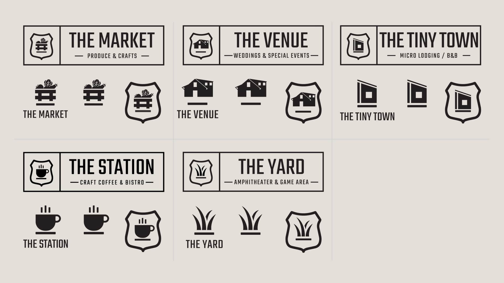
Introduction: Daley Design was approached by Sawyer’s Landing, a multifunctional venue in Fredericktown, MO, to elevate their brand identity and create a cohesive visual representation for their diverse offerings, including a coffee shop/bistro, an event venue, and a tiny home community. The goal was to expand on the existing brand design, incorporating natural and rich colors that complemented the location. This case study highlights the collaborative process and outcomes achieved by Daley Design in meeting the client’s objectives, which involved creating a vintage-inspired logo and a fun and exciting overall branding concept.
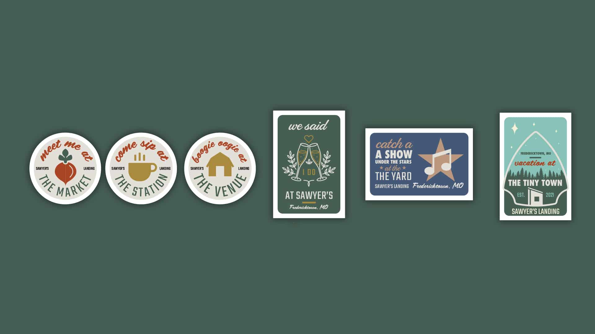
Client Background: Sawyer’s Landing, owned by the Brubacher family, sought to unite the local community through their multifaceted venue. The property, formerly the historic Clark National Forest Ranger Station, held a special place in their hearts. The existing logo for The Station, their coffee shop/bistro, served as a foundation for the brand concept. Sawyer’s Landing desired a nostalgic and welcoming atmosphere, drawing inspiration from vintage National Forest Ranger Station imagery. They envisioned an expanded color palette, rich in natural hues that harmonized with the location’s surroundings. Additionally, the client expressed a desire to create fun and memorable takeaways for merchandise and advertising, such as illustrative tee-shirts, posters, magnets, patches, stickers, and postcards with a retro 50’s style.
Daley Design’s Approach: Daley Design embraced the client’s vision and embarked on a collaborative journey to enhance Sawyer’s Landing’s brand identity. Our team conducted thorough research, exploring vintage aesthetics, National Forest Ranger Station imagery, and colors that would resonate with the location. With a focus on nostalgia, natural elements, and a touch of retro flair, Daley Design set out to create a visually appealing and engaging brand concept.
Brand Elements Created:
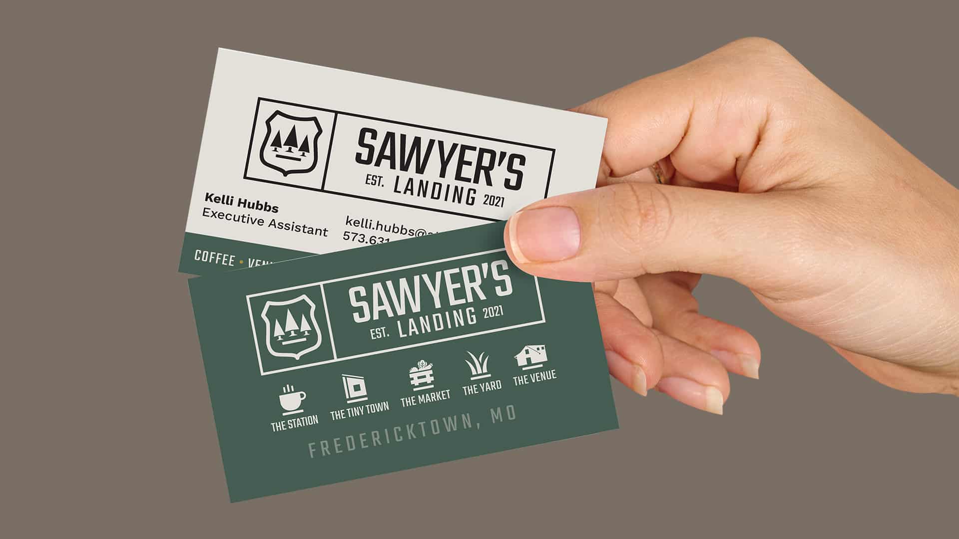
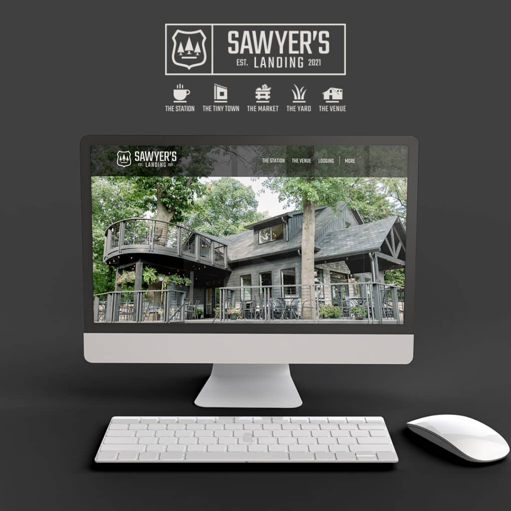
- Logo Design: Daley Design developed a vintage-inspired logo for Sawyer’s Landing, drawing inspiration from National Forest Ranger Station imagery. This logo served as the centerpiece of the branding concept, capturing the essence of the venue’s history and charm.
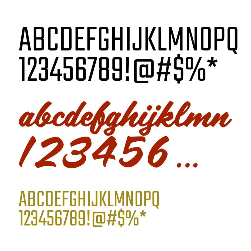
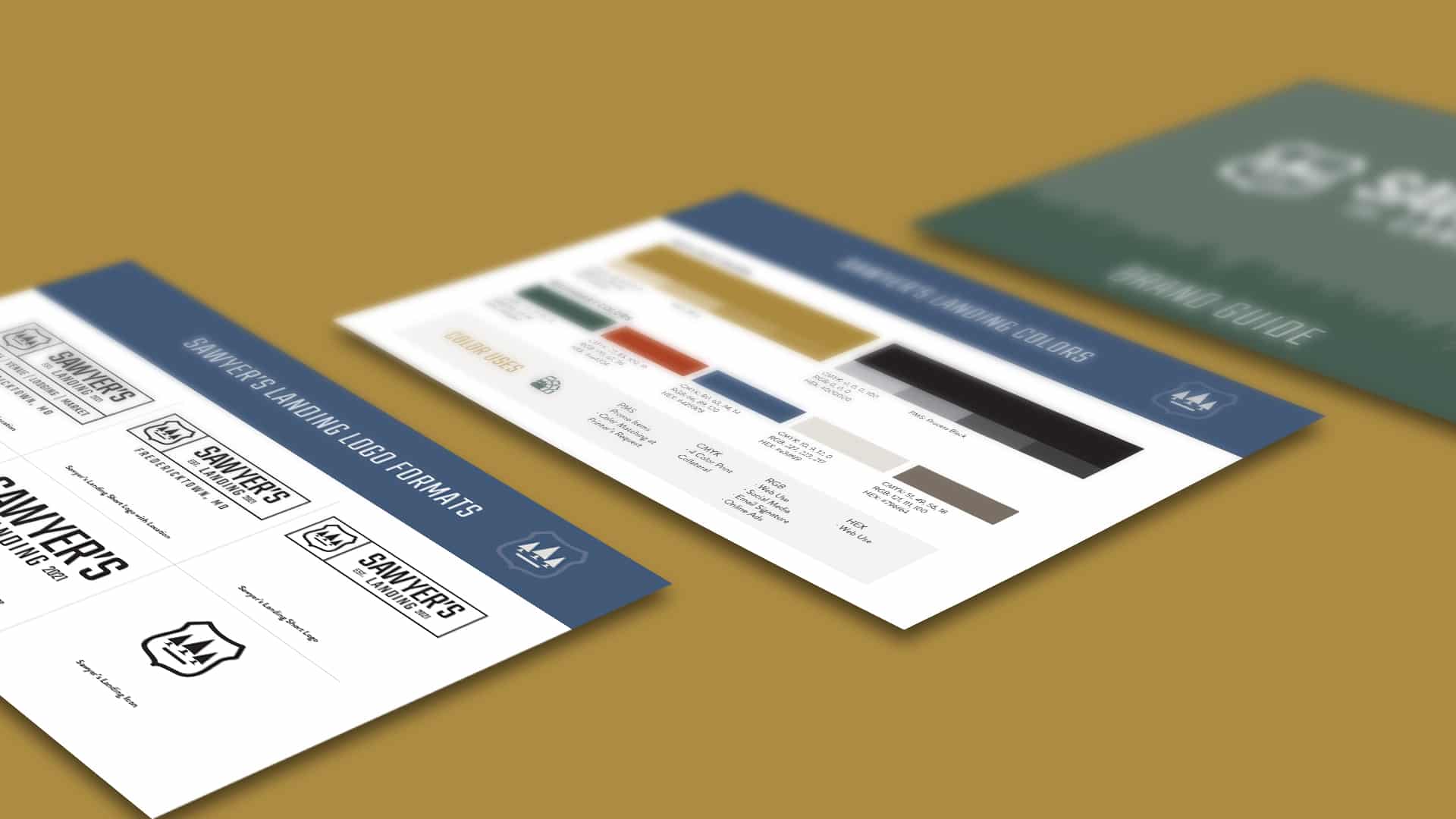
- Color Palette: Building upon the existing brand’s color palette, Daley Design expanded it to include natural, rich colors that complemented the location. The chosen colors aimed to evoke a sense of nostalgia, warmth, and harmony with the surrounding environment. These colors would be applied consistently throughout various brand touchpoints.
- Branding Concept: Daley Design developed a fun and exciting branding concept that welcomed guests to visit Sawyer’s Landing and its various attractions. Embracing a retro 50’s style, the concept incorporated vintage park-style illustrative elements into merchandising and advertising materials.
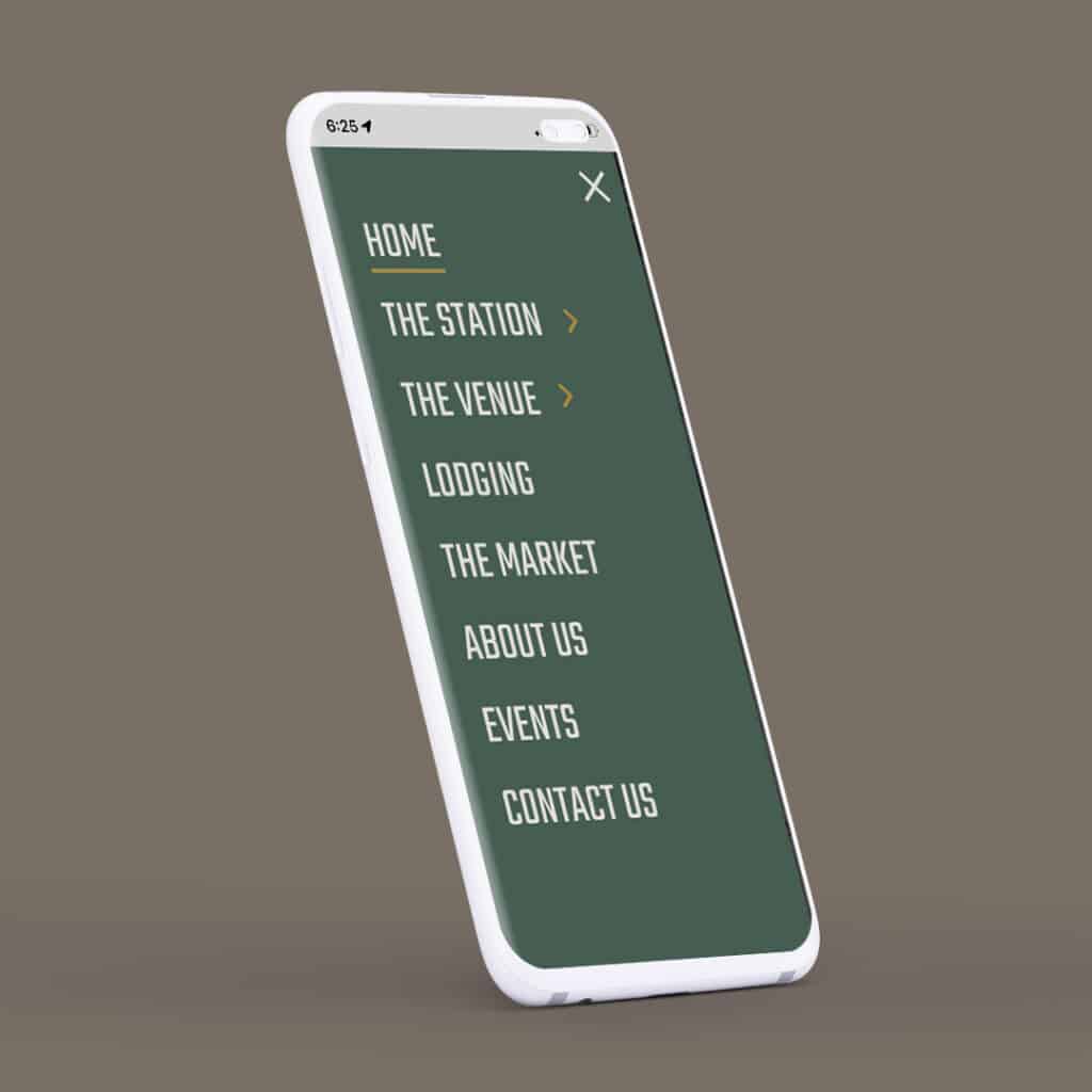
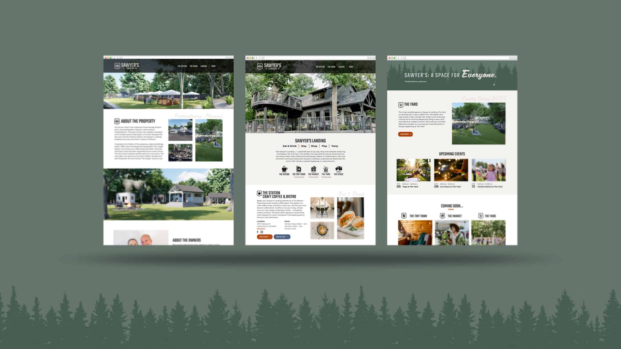
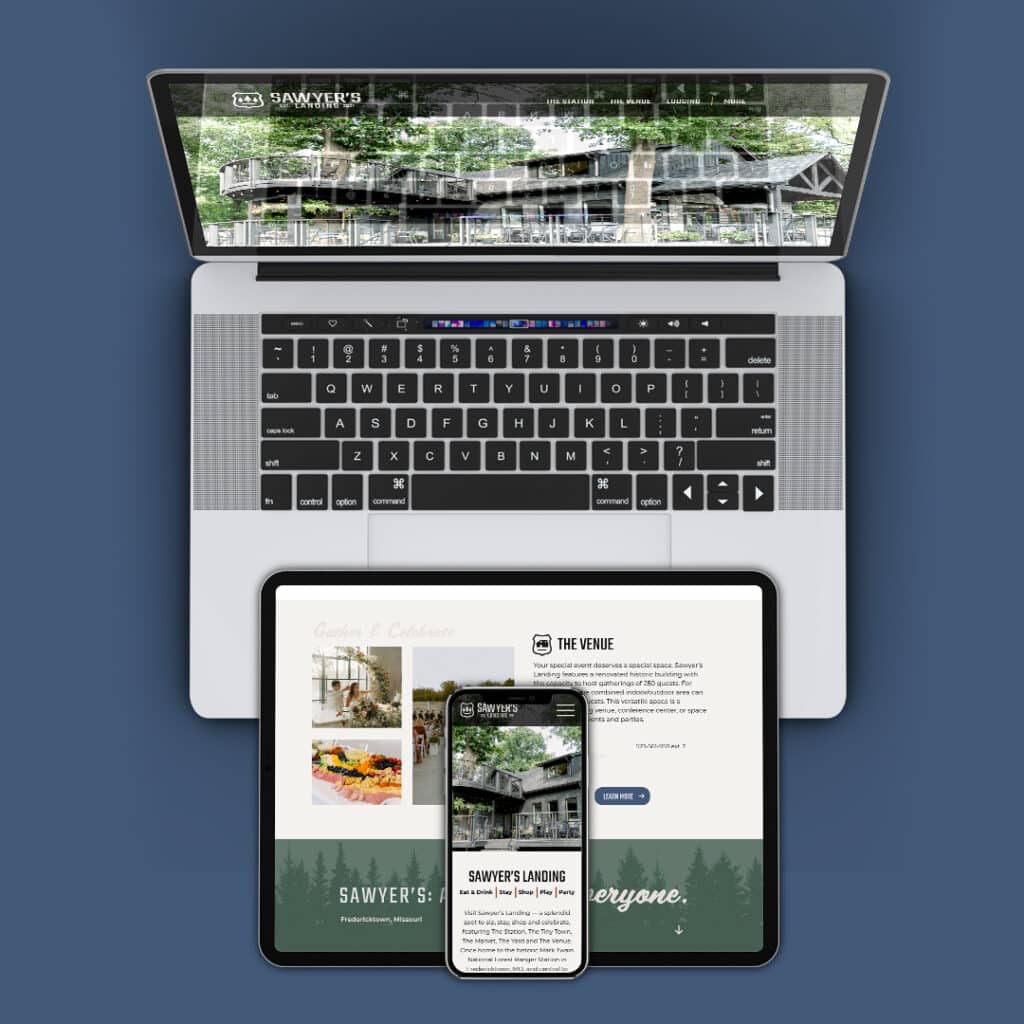
- Custom WordPress Website: In addition to the visual branding elements, Daley Design created a custom, secure, location, and event-driven WordPress website for Sawyer’s Landing. The website was designed to provide a seamless and user-friendly experience, showcasing the venue’s various offerings, including the coffee shop/bistro, event venue, and tiny home community. The website incorporated features such as events, location-specific information, booking capabilities, and robust security measures to ensure a smooth and secure online experience for visitors. The design and functionality of the website aligned with the overall brand identity, reflecting the nostalgic and welcoming atmosphere of Sawyer’s Landing.
Outcomes and Results: Through Daley Design’s creative efforts, Sawyer’s Landing achieved an enhanced brand identity that seamlessly blended vintage aesthetics, natural colors, and a touch of retro charm. The vintage-inspired logo captured the venue’s history while creating a visual connection to The Station. The expanded color palette complemented the location, creating a harmonious visual experience. Additionally, the fun and exciting branding concept allowed for memorable merchandising and advertising materials that conveyed the venue’s inviting atmosphere. Sawyer’s Landing now possesses a distinct brand identity that sets it apart and resonates with its target audience, leaving a lasting impression on guests and visitors.
