PACKAGE DESIGN
Branding & web design
Daley Design’s work on the branding, package design, and website design for Carrie’s Merries, an award-winning Bloody Mary Mix and cocktail line, was a resounding success. Read more about how the successful rebranding project has elevated the brand’s reputation and increased sales, making it a notable case study for branding, package design, and website design below.
Ready to start your project?
Carrie’s Merries is an award-winning brand of Bloody Mary Mix and garnish line that has gained immense popularity among cocktail enthusiasts. In 2021, the company approached Daley Design, a creative design agency, to revamp their branding, package design, and website design. Daley Design, being a seasoned design firm, understood the challenges of creating a unique and engaging design that would differentiate the brand in a competitive market.
Objective: The primary objective of the project was to create a modern, stylish, and sophisticated design that would make Carrie’s Merries stand out in the market. The team at Daley Design aimed to create a brand identity that reflected the quality of the product and the passion of the founder, Carrie. They also aimed to create an appealing and user-friendly website that would make it easy for customers to purchase the products.
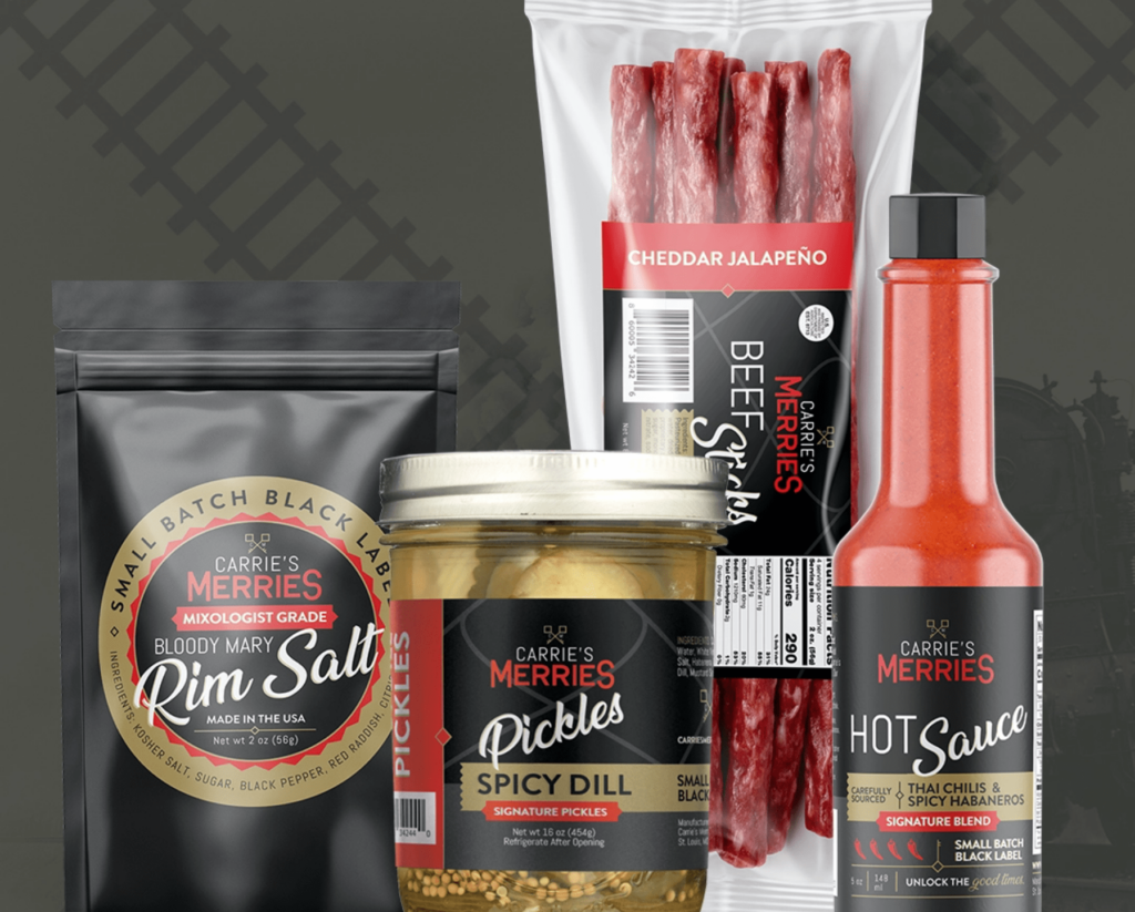
Branding: Daley Design’s branding strategy focused on capturing the essence of the Carrie’s Merries brand. The team worked closely with the founder to identify the core values, vision, and mission of the brand. The result was a unique brand identity that combined traditional elements with modern design aesthetics.
The new logo design was bold, modern, and eye-catching. The typography used was elegant and clean, with a touch of sophistication. The color palette was a mix of vibrant red, white, gold, and black, reflecting the freshness and purity of the ingredients used in the products.
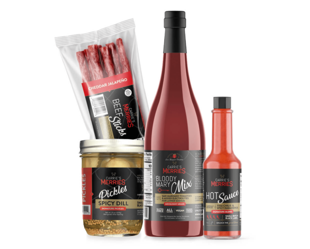
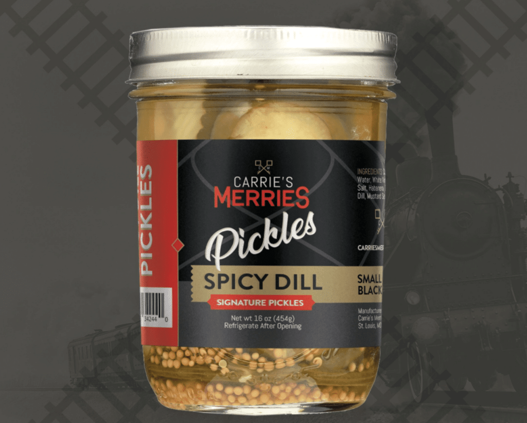
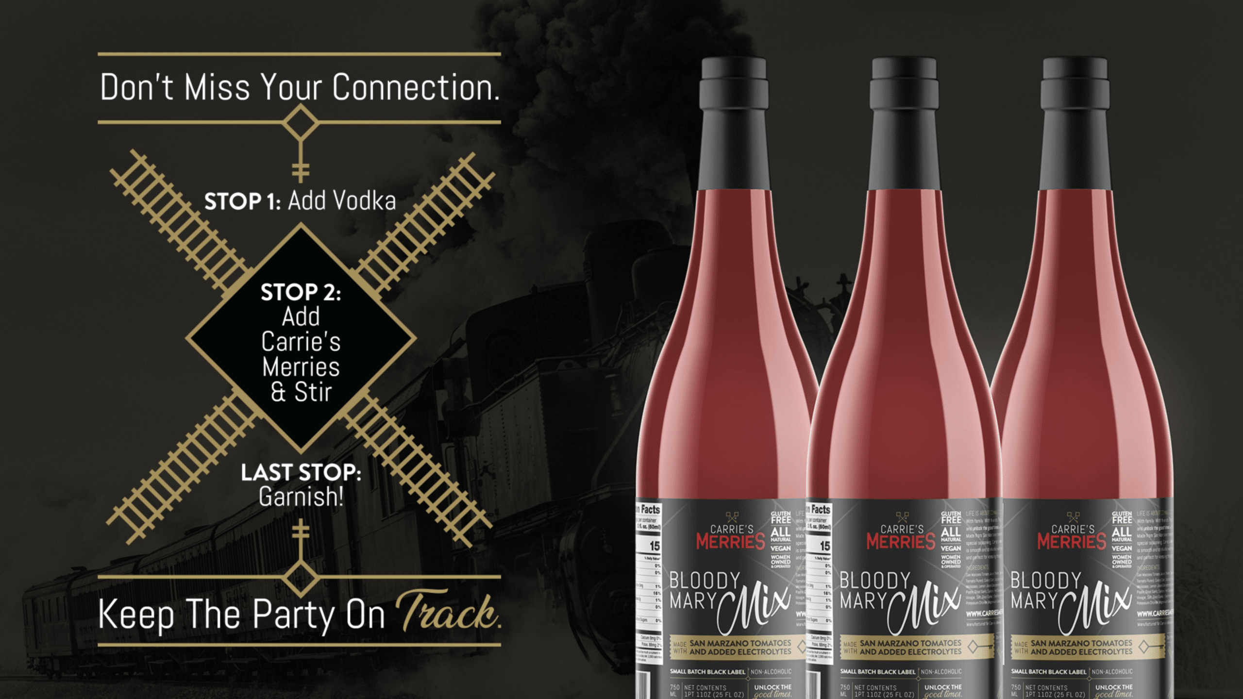
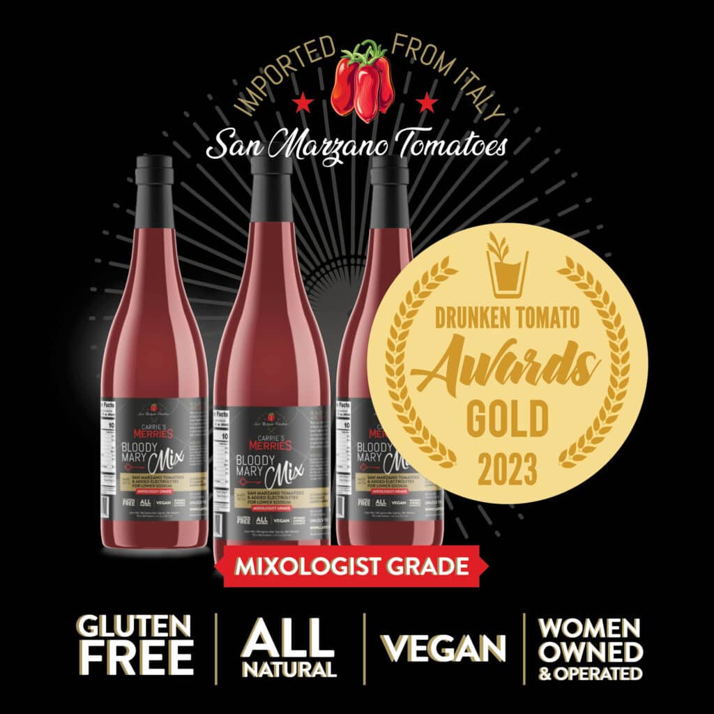
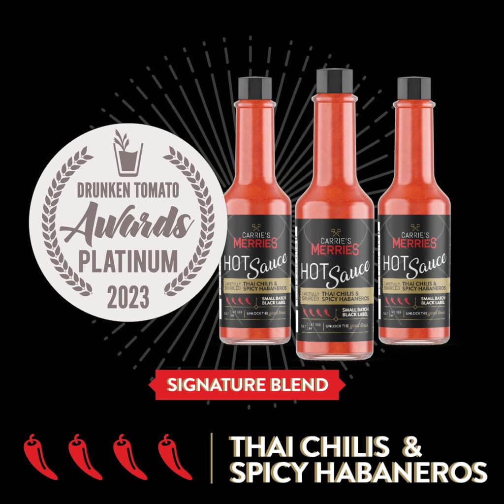
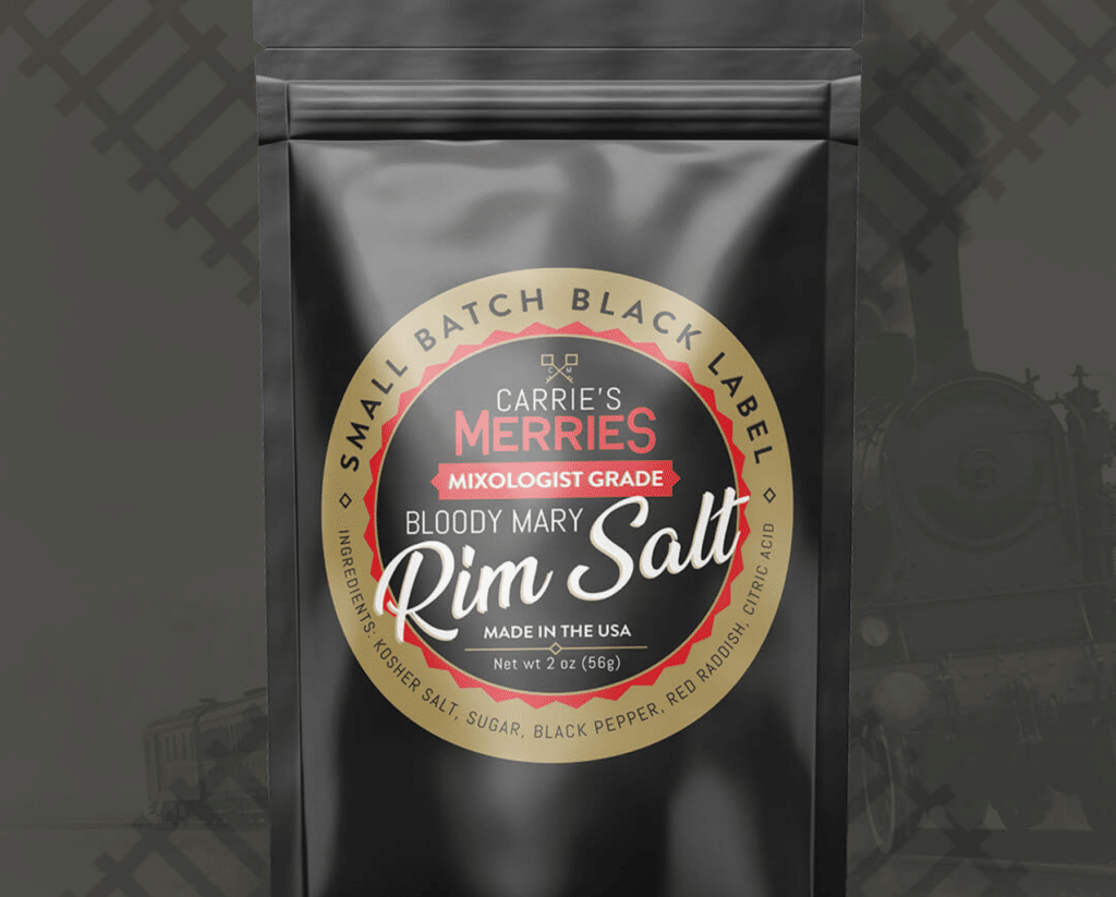
Package Design: Daley Design aimed to create a package design that would not only be functional but also visually appealing. The design team used the brand identity to create a cohesive package design that would be instantly recognizable in stores. The packaging used a clear glass bottle to showcase the vibrant colors of the Bloody Mary mix.
The design team also created a unique label design that showcased the key ingredients of the product. The label used a combination of illustrations and bold typography to convey the freshness and quality of the product. The label also featured the new logo design, creating a cohesive look across all branding elements.
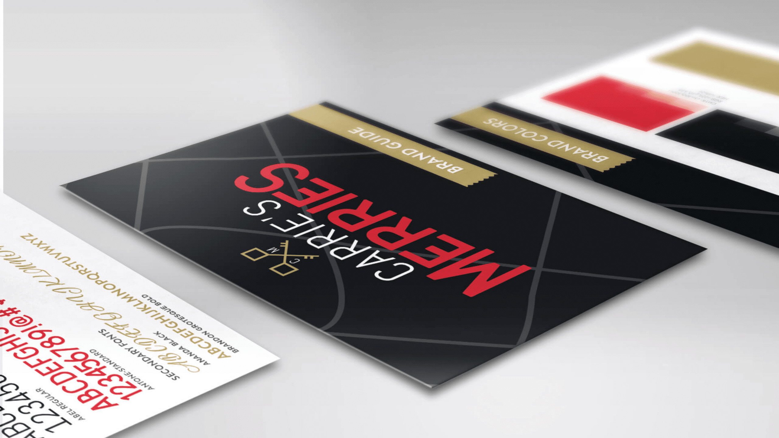
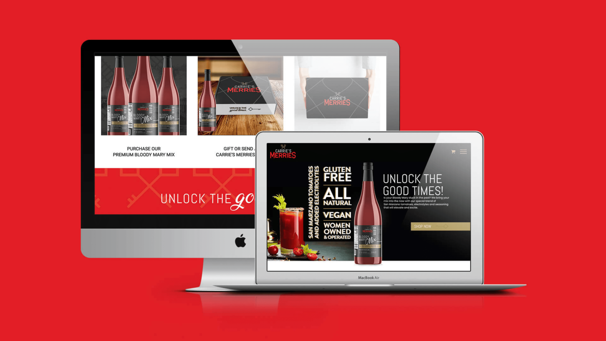
Website Design: The website design was an essential part of the project, as it would be the primary platform for customers to learn about the brand and purchase the products. Daley Design created a website that was both user-friendly and visually appealing. The website used the brand identity to create a cohesive look and feel across all pages.
The homepage featured a full-screen video showcasing the process of creating the Bloody Mary mix. The navigation menu was easy to use, with clear call-to-action buttons for purchasing the products. The website also included a blog section, where the founder could share her passion for mixology and cocktail culture.
Conclusion: Daley Design successfully revamped the branding, package design, and website design for Carrie’s Merries, creating a unique and engaging brand identity that differentiated the brand in a competitive market. The new design elements showcased the quality and freshness of the products, making them more appealing to customers. The result was a successful rebranding project that elevated the brand’s reputation and increased sales.
