BELLON WRECKING
Branding & web design
This case study showcases the successful rebranding of Bellon Wrecking by Daley Design. The objective was to create a modern brand identity while honoring the company’s history. Through a revamped logo and user-friendly website, Bellon Wrecking established itself as a trusted and forward-thinking demolition company, attracting new customers and setting the stage for future growth.
Ready to start your project?
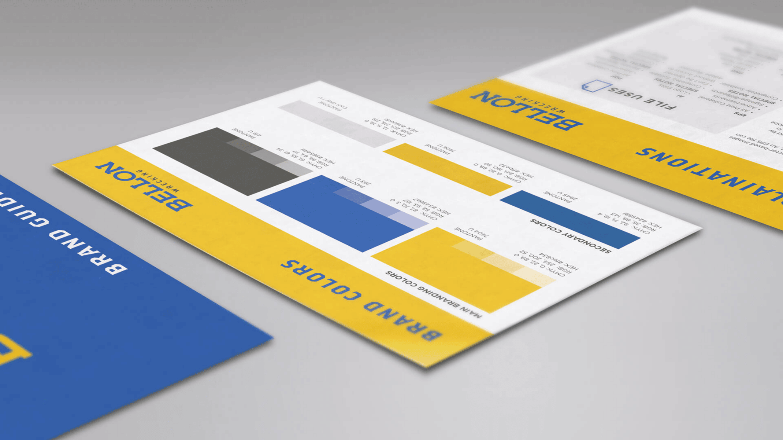
Introduction: Bellon Wrecking, a family-owned demolition company established in the 1970s, partnered with Daley Design to undergo a rebranding process. The aim was to create a modern brand identity that honored their history while appealing to their target audience in the construction and wrecking industry. Retaining the existing navy and yellow color scheme, Daley Design developed a new logo and brand identity that emphasized longevity, quality, and safety.
Challenge: The challenge was to update Bellon Wrecking’s brand without alienating existing customers and attract new clients, including homeowners, homebuilders, general contractors, and realtors. The rebranding needed to position the company as experienced, reputable, and committed to safety.
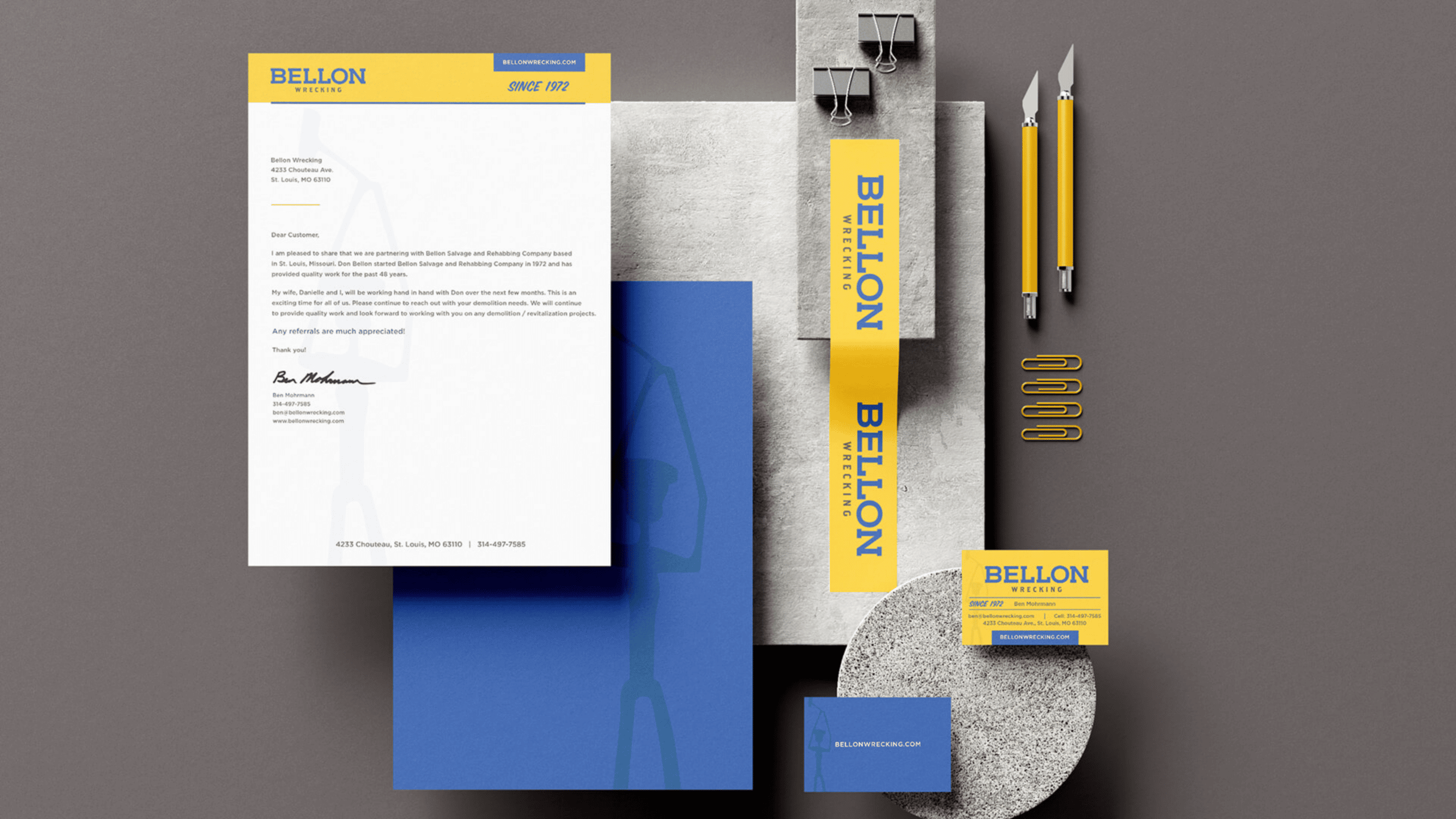
Design Approach: Daley Design maintained consistency by choosing the name Bellon Wrecking and developed a bold, modern logo. The logo incorporated yellow and navy blue, representing the construction and wrecking sector. Typography was contemporary and legible, while a stylized letter “B” symbolized expertise and uniqueness.
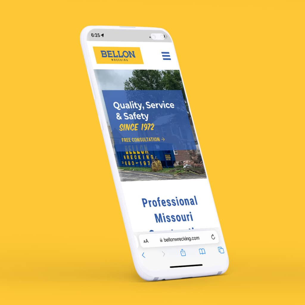
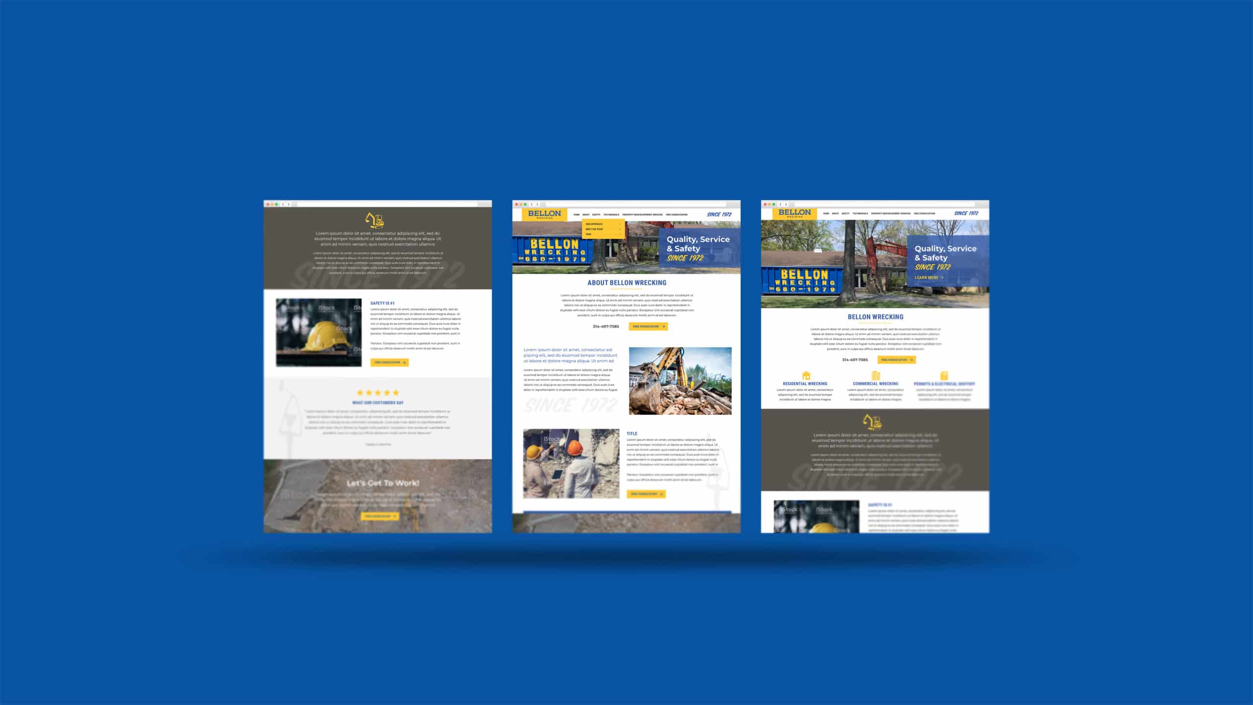
Website and Online Presence: Daley Design created a user-friendly website that showcased Bellon Wrecking’s services, including permits, utilities termination, and debris hauling. The site utilized the established color scheme, incorporated project imagery, and implemented SEO techniques to attract organic traffic.

Result: Bellon Wrecking’s rebranding positioned them as a trusted and forward-thinking player in the industry. The new logo highlighted longevity, quality, and safety, setting them apart from competitors. The updated brand identity and website expanded their customer base and represented their services consistently.
Conclusion: Through a meticulous rebranding process led by Daley Design, Bellon Wrecking revitalized its brand identity, establishing a strong presence in the demolition industry. The modernized logo, consistent color palette, and updated website positioned the company as a reliable and forward-thinking partner. Bellon Wrecking attracts a diverse range of clients, from homeowners to industry professionals, by emphasizing quality, safety, and customer satisfaction. The successful partnership between Bellon Wrecking and Daley Design showcases the power of a well-executed rebranding strategy, ensuring continued success for years to come.
“Daley Design recently helped with some re-branding of a business I purchased. Maureen was so helpful and did a great job creating the image I was looking for. She was always very quick to respond and exceeded my expectations with her level of design and professionalism! I would highly recommend to anyone!”
– Danielle M, Bellon Wrecking
